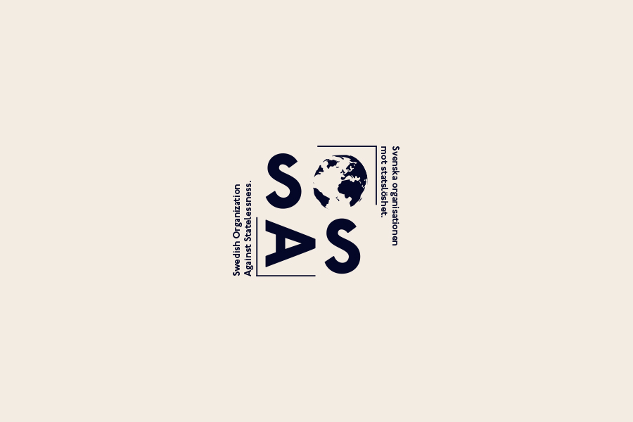
Skip to content
Caroline L. Storm
Videography, Photography & Broadcasting
Caroline L. Storm
  • Home
Instagram page opens in new windowYouTube page opens in new windowLinkedin page opens in new window
  • Home

Project

Even though graphics are not my main focus, every now and then I do end up doing some projects here and there. This time I was asked to redesign SOAS previous visual concept, as it was not carrying the message they wanted. We briefed some ideas, what did they feel was missing from their previous concept, what did they like and dislike, and what were elements they wanted to portray. We agreed that the globe of the earth was something to keep, as it was really important to push for their organization.

Concept

I wanted to give SOAS a clean, modern yet classy visual concept. Natural elements, such as desserts and sand, water and the planet earth were my main sources of inspiration for the colours, combined with the activeness of city-life. These elements all give a good visualization and representation of the brand. Further down you can see a few photos that give an overall feeling of the brand's visual communication.

Acronym

For me it was very important to keep the logotype and concept modern, but not generic. The name of the organization is rather long, hence why the acronym is in focus. The logotype can be used either with the half-frame and the full name on the sides or simply with the letters of the acronym, without frame and the full name, for a more minimalistic and less cluttered format that could, for example, be used on small areas.

Client: Swedish Organization Against Statelessness

Category: Graphic Design

Date: March 2020

SOAS, Swedish Organization Against Statelessness, is a non-profit organization against statelessness based in Sweden. Their goal is to ensure everyone’s right to citizenship, by educating people and influencing politicians. 

Visit SOAS’s webpage.

Visualisation of the brand.

I decided to keep up with blue like their previous identity, but giving it a new, darker, tone, to stay away from the typical social-media-blue (looking at you, Facebook). Blue portrays calmness and trustworthiness, especially combined with a smooth, and classy cream color. Also, a few lighter tones were put in, and a pop of red for highlights, as a break-off in their identity. 

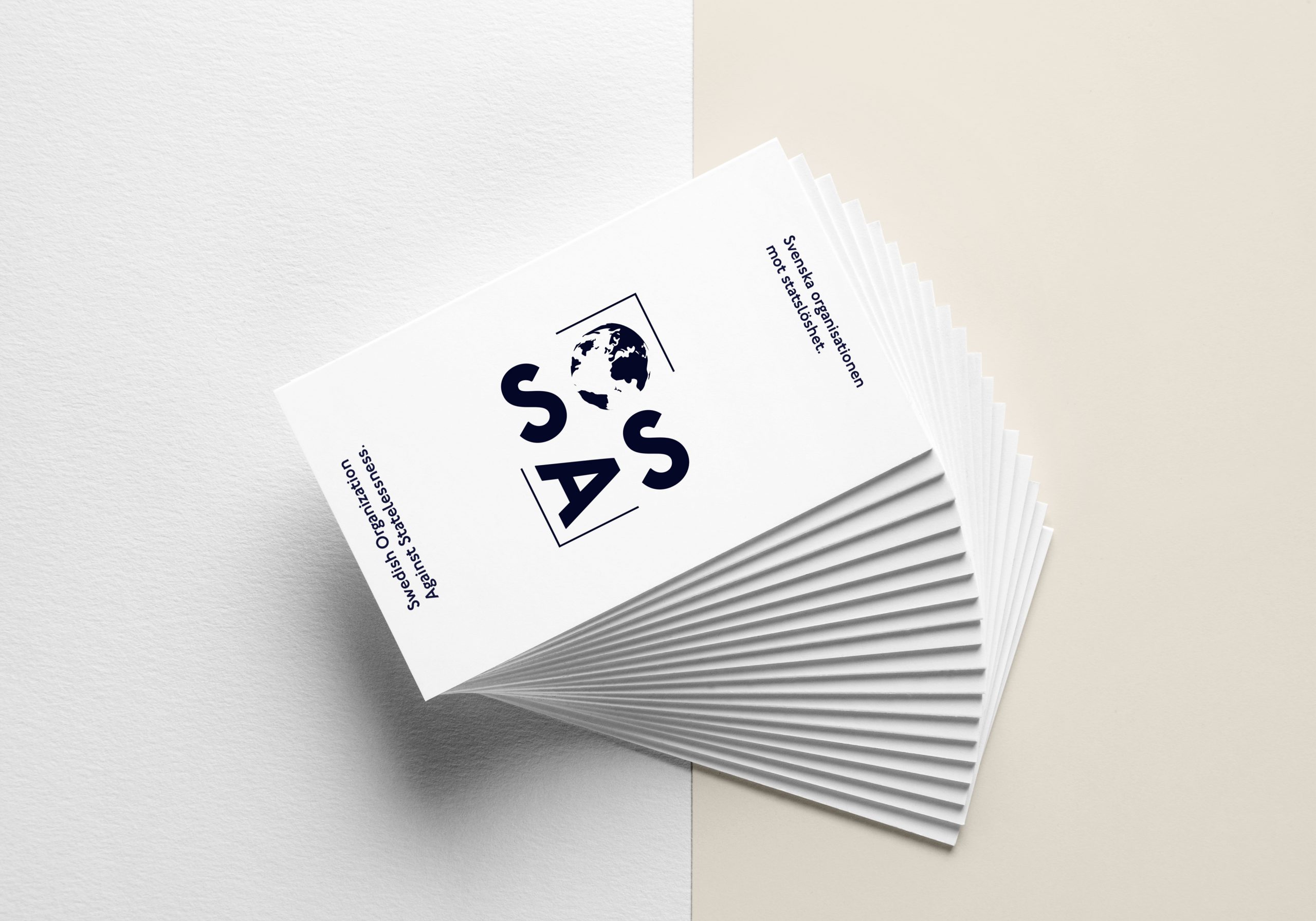
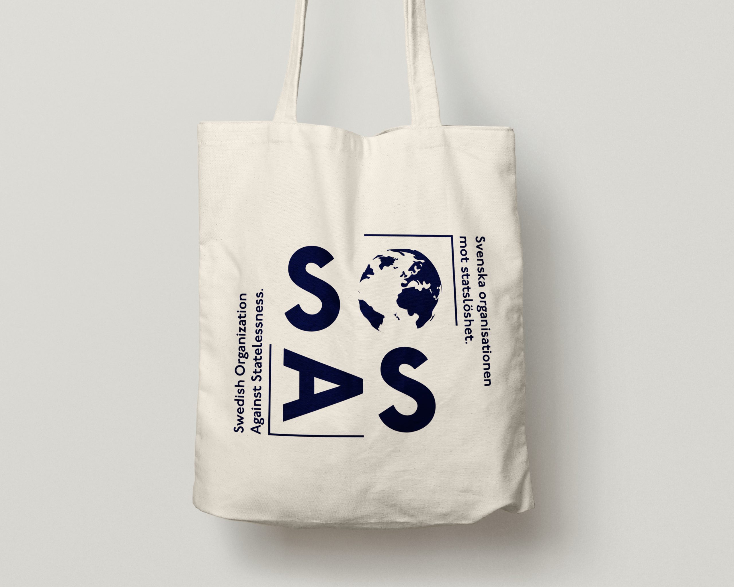
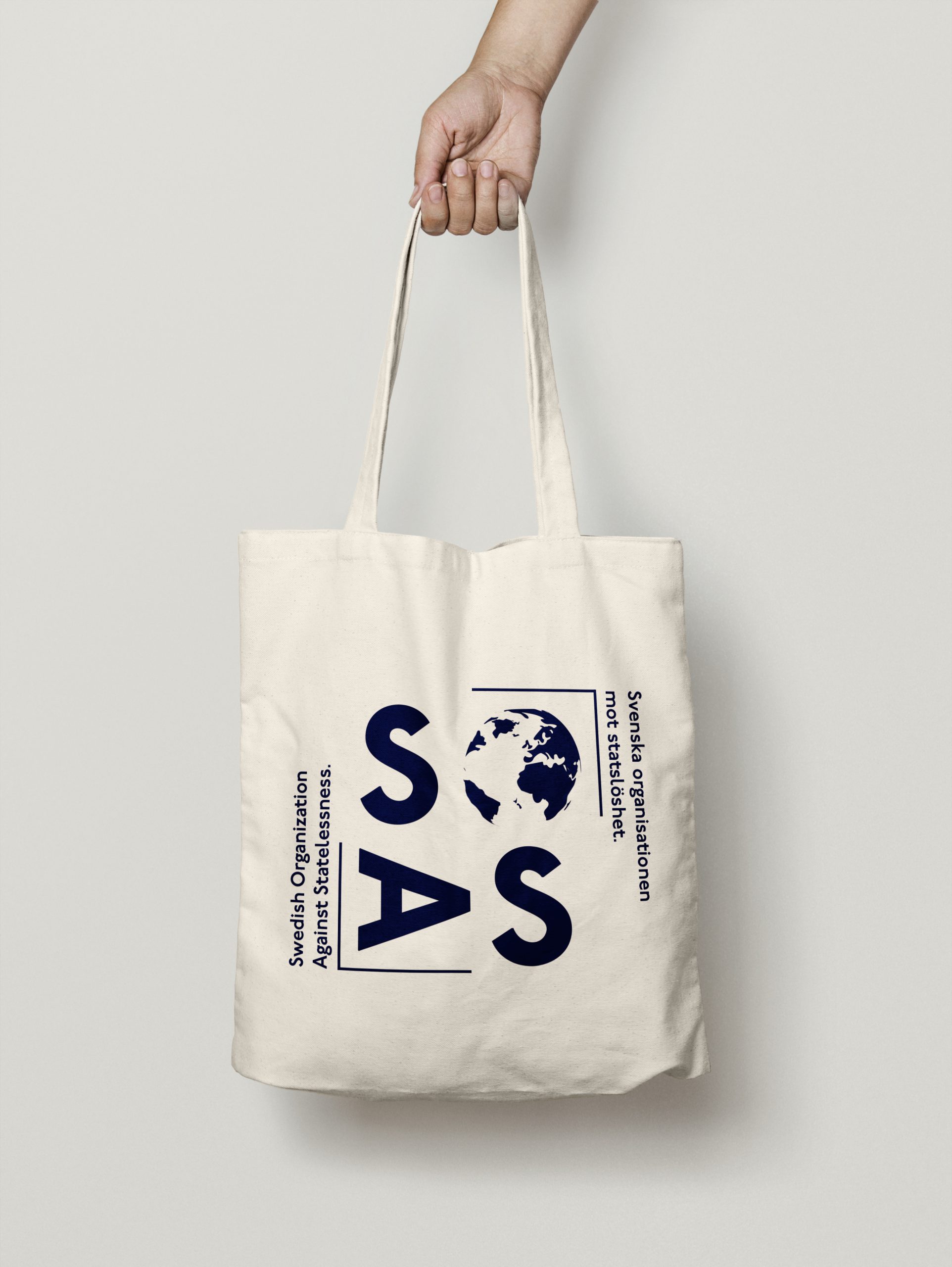
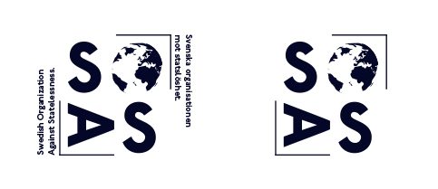
To the right, you see two versions of the logo, one more suitable for big print, and the less detailed version that can be used for smaller objects and prints.

The mockups are just a proposition of how to use the elements.
Share this post
Share on FacebookShare on Facebook Share on LinkedInShare on LinkedIn TweetShare on Twitter

Project navigation

NextNext project:Examination Project: Stress for Success

More Projects

Reel

Photography: My Fablelike Island

Frodo’s Film Fam

Amsterdam NL / Gotland SWE

Find us on:

Twitter page opens in new windowYouTube page opens in new windowLinkedin page opens in new windowPinterest page opens in new windowInstagram page opens in new window
Caroline L. Storm
© Caroline Storm m.u.f. - 2024. All Rights Reserved.
  • About
  • Contact
Bottom Menu

hej@carolinestorm.com

Go to Top